Expedia Group × Backstage
Making the Platform Developers Choose
Proposals carried through to approval and handoff — and a usability practice the team didn't have before.
A note on what you're seeing. I take my clients' confidentiality seriously. The artifacts on this page are re-creations and abstractions of the real work, and the numbers are illustrative of project outcomes rather than audited figures. Happy to walk you through the genuine article — just ask.
The situation
Internal developers are the world's most demanding users — and a platform they don't choose is a platform that fails.
Backstage, born at Spotify and open-sourced, promises one front door for developer chaos: services, docs, ownership, tooling, all in one place. Expedia's platform teams were building on it for an audience that can, and will, route around anything that annoys them. Nobody can be mandated into loving a portal. They either reach for it or they keep their bookmarks.
So the brief was really about adoption: find the moments where the portal was almost useful and make them unambiguously useful, then prove it to the people funding the work.
My role
I was the UX designer embedded with the platform teams for a year — running envisioning across org boundaries, designing the surfaces, and, over time, standing up the usability practice the group had been operating without.
The process
Beat one
Cross-team envisioning
Getting stakeholders from different orgs to agree on where the portal should go before arguing about what it should look like. Most platform disagreements are actually scope disagreements wearing a UI costume.
Beat two
Storytelling as a design tool
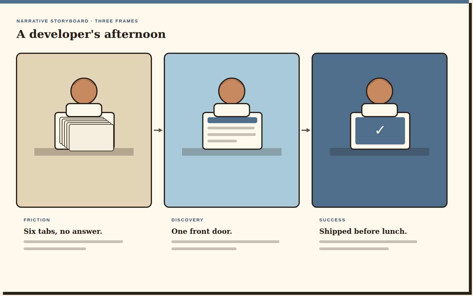
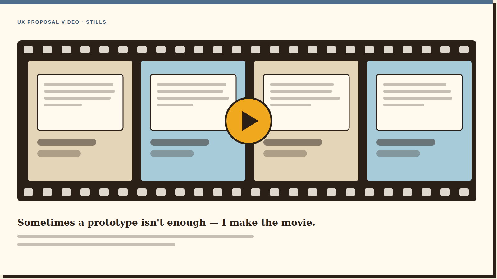
Narrative storyboards, and then produced videos, to sell UX proposals. A storyboard makes a reviewer feel the friction; a two-minute video makes twelve people who missed the meeting feel it too. This is the part of my practice people remember.
Beat three
Wireframes to prototypes to handoff
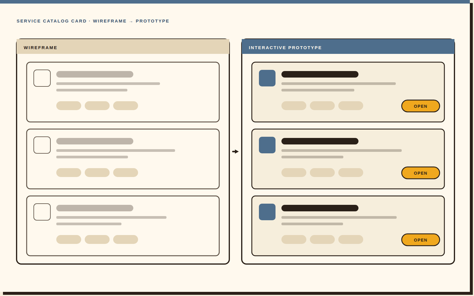
The unglamorous middle: turning an agreed direction into something a front-end engineer can build without guessing. Service catalog surfaces got the most attention — that's the page developers actually live on.
Beat four
Founding a usability practice
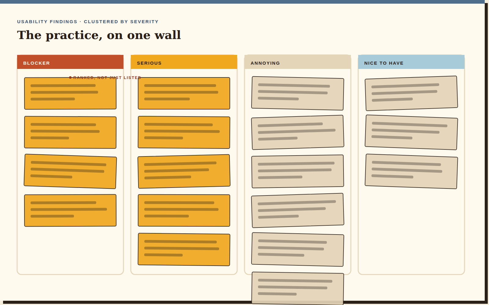
Championed it, established it, ran the studies. The team had strong engineering instincts and no repeatable way to find out whether they were right. Building that muscle — recruiting, scripting, running, ranking findings so they were actionable — is the outcome I'm proudest of, because it kept going after I left.
1 yr*
The outcome
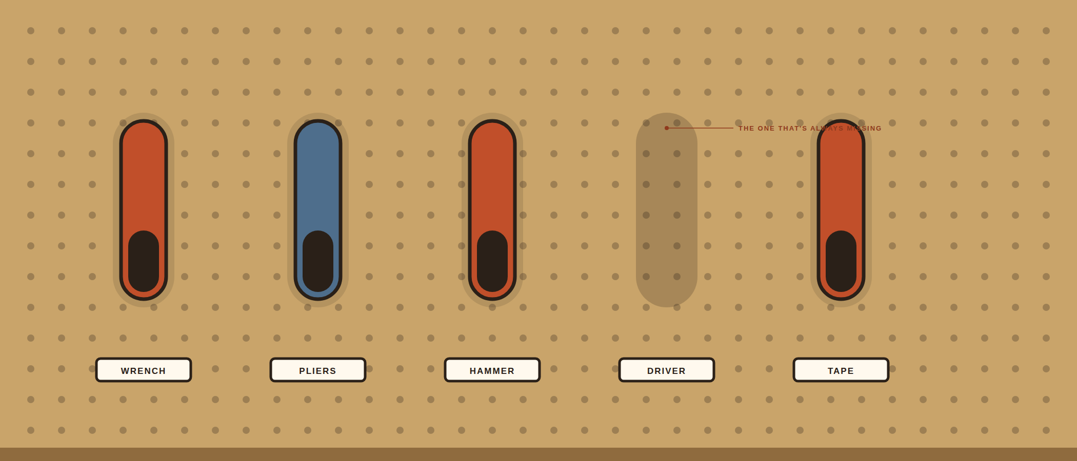
Proposals carried through to approval and handoff across a year-long engagement — and a usability practice, run by the team rather than by me, that was still running when the contract ended. The durable outcome wasn't a screen. It was a habit.
Reflection
“Developers are users too — they're just users who will absolutely tell you what they think.”
Which is a gift, once you stop being defensive about it. The fastest research I've ever run was on this team, because nobody hedged. What I'd do differently: start the usability practice in month one instead of month four. I spent the early weeks proving I was worth listening to when I could have spent them showing people their own users.