Citizens Bank · FastLine
Cutting HELOC Approvals in Half
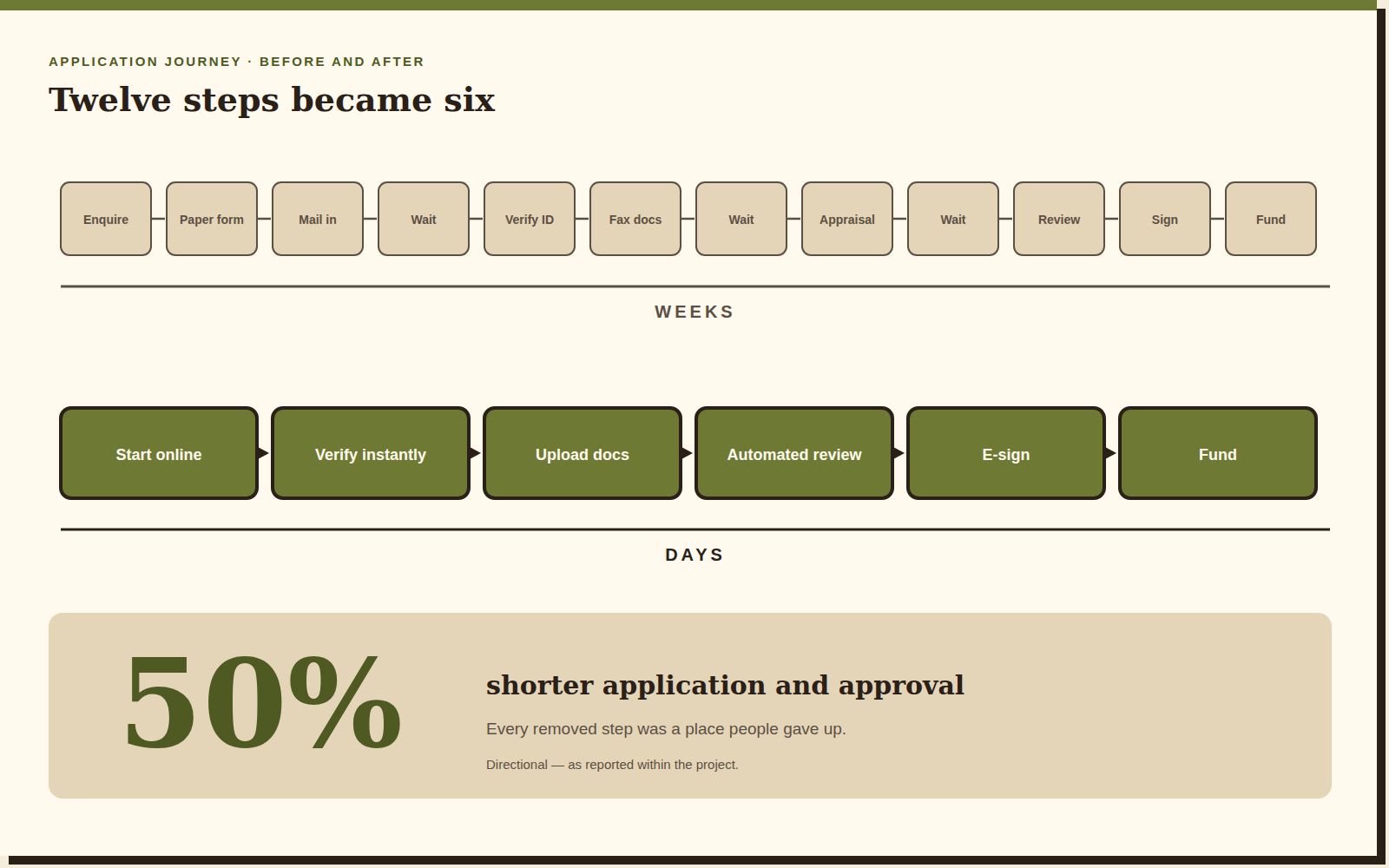
A 50% shorter application and approval process for one of the most stressful products in consumer finance.
A note on what you're seeing. I take my clients' confidentiality seriously. The artifacts on this page are re-creations and abstractions of the real work, and the numbers are illustrative of project outcomes rather than audited figures. Happy to walk you through the genuine article — just ask.
The situation
A HELOC is a big, frightening, document-heavy decision — and the process was doing nothing to help.
Home-equity lines of credit sit at the intersection of every anxiety consumer finance can produce: large sums, your actual house as collateral, weeks of silence, and a paperwork trail that assumes you have a fax machine. People don't abandon these applications because they changed their mind. They abandon them because they lost the thread.
FastLine set out to make the whole thing fast and humane — not just digitised, but genuinely shorter, and legible at every step so an applicant always knows where they stand.
My role
I was the senior UX designer on the experience, working inside a critique-heavy weekly rhythm with product owners and bank stakeholders. Unusually for a project this size, I carried wireframes, UX writing and custom illustration in the same hand — which meant the tone of a screen and the shape of a screen got designed together rather than negotiated afterwards.
The process
Beat one
Working in the open
Weekly design presentations to product owners and stakeholders. Designing in public is slower on any given Tuesday and dramatically faster over a quarter — decisions get made once, in the room, with the people who can make them.
Beat two
Usability studies driving decisions
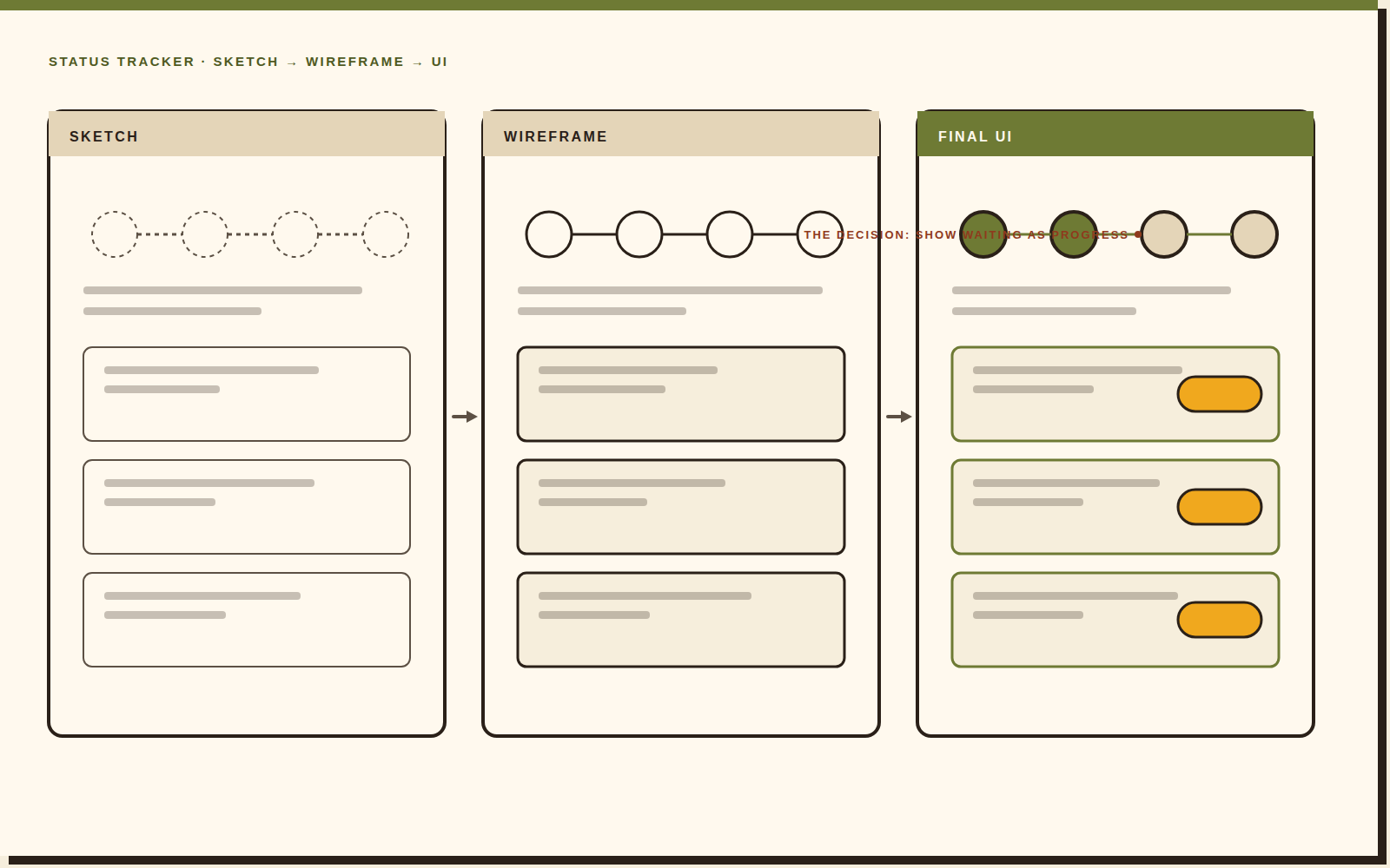
The studies kept pointing at the same wound: waiting. Applicants could tolerate a long process; they could not tolerate an opaque one. That reframed the brief from “fewer screens” to “never leave someone wondering,” and it's what drove the status tracker below.
Beat three
Full-stack craft
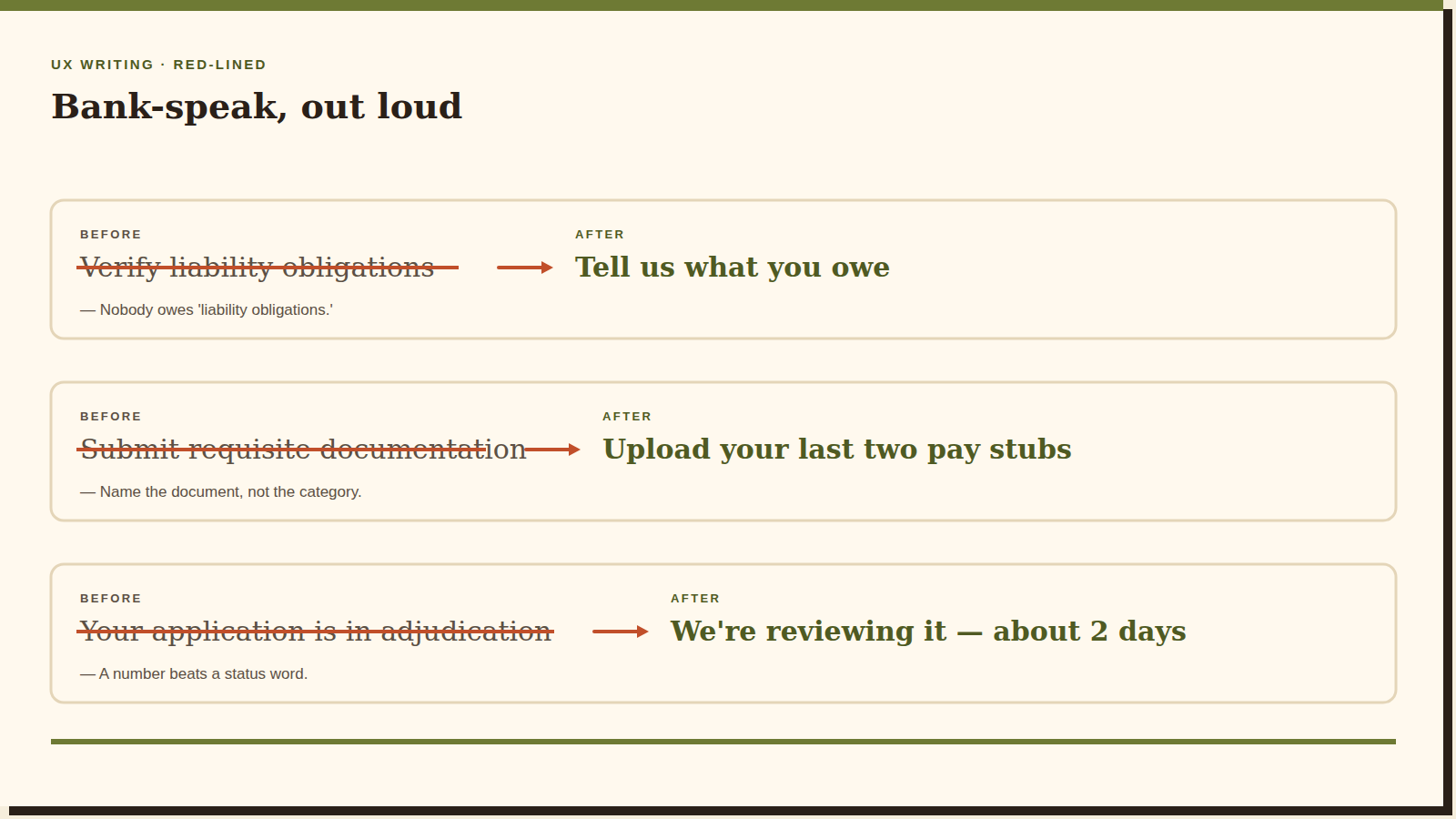
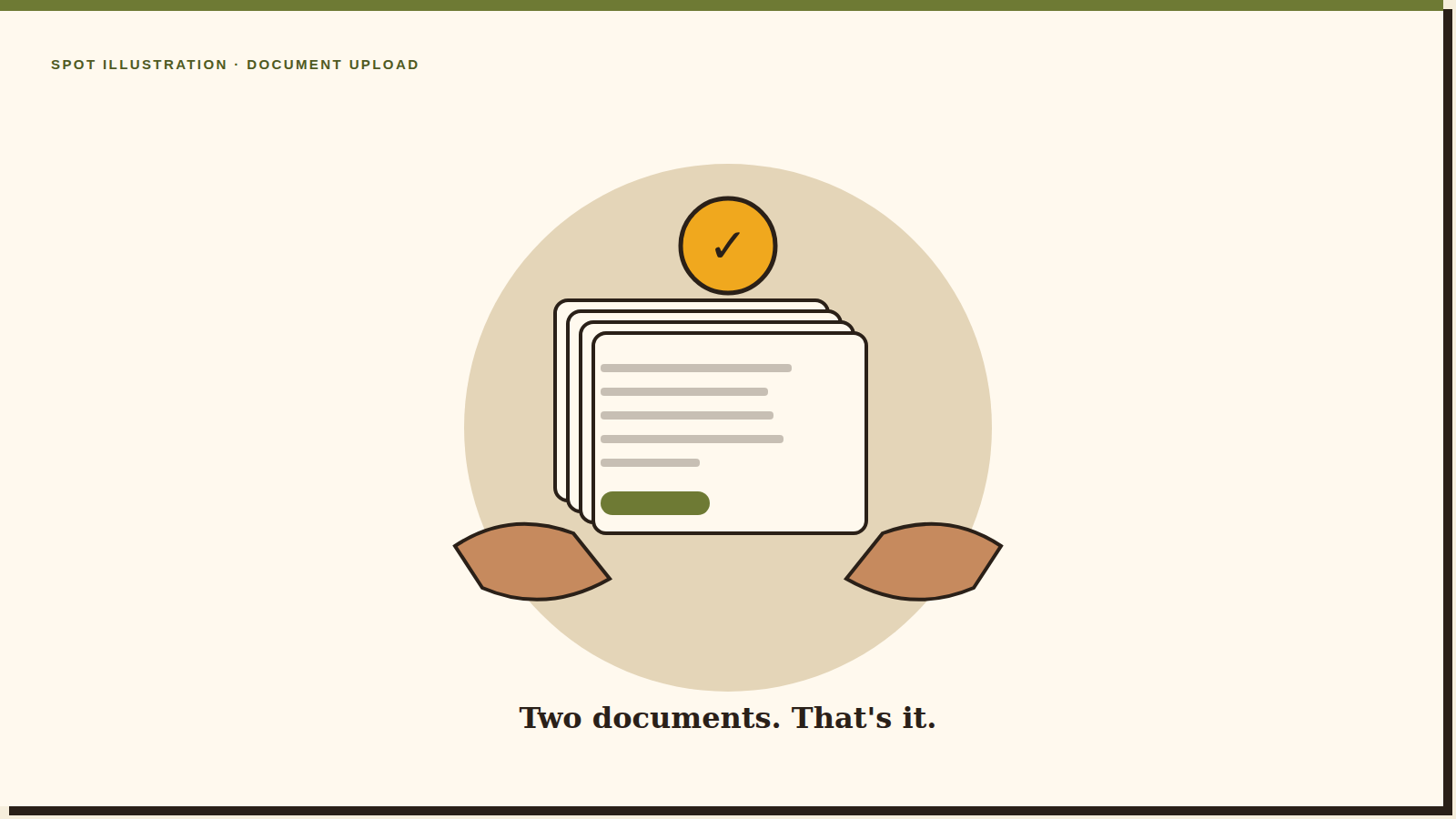
Wireframes, the words on them, and the illustrations beside them. Bank language is a design problem: most of what makes a financial form frightening is vocabulary, not layout.
Beat four
High-fidelity prototypes
Clickable Figma prototypes for validation and for handoff. Testing a real flow rather than a deck is the difference between “stakeholders liked it” and “applicants got through it.”

50%*
The outcome
A 50% shorter application-and-approval process. The redesign was explicitly built to reduce abandoned applications and applicant anxiety — every step removed was a place people used to give up.
Reflection
“Finance UX is trust UX. Every screen either earns confidence or spends it.”
What I'd push further: the waiting states. We made them honest, but honest isn't the same as reassuring. Given another pass I'd design the silences as deliberately as the screens — what a bank says on day four of a quiet week is worth as much as anything in the form.